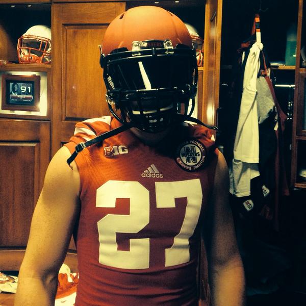
2014 Alternate Unis?

Bane ‏@NathanGerry 12m

YESSSIR
2757.png
2757.png


Bt91fUeIQAEgTLy.jpg


Sam Foltz ‏@samfoltz27 5m

Pretty pumped about my new helmet this year! #heismanyear #puntersarepeopletoo
Bt93VsBCYAEF1mL.jpg


I'm not a fan of any alternates, but I'd consider this rendition a huge upgrade over the first couple attempts assuming they wear the uni with the number and not that silly over-sized "N".

 
I thought last year's black jerseys were too forced. I don't mind black as an accent color on alt uniforms but NU's colors are scarlet and cream.

Also, go back to 1 TV game a year, 1 pm kick offs, no Husker Vision, and get off my lawn!!!
HA! Nice!

UA is making really cool stuff.

I love the helmets

 
While the all red is not my favorite look. I don't think it's all that bad. The main problem I have had so far is that this is the 3rd year of these and Adidas has yet to hit the mark where there would be a majority of wow's. I'm not talking about the people who are against alternates altogether no matter what. I am talking about people who are looking forward to alternates. They haven't come up with a design concept that a majority likes and maybe even converts some non alternate people into believers.

It's one thing if you have several games where you switch up uniforms and can maybe miss on one or 2 combos. But when you have one game and essentially 12 months to come up with a great design concept, I say you are not earning your money. I mean, someone used photoshop at work and designed a modern version of the Bugeater uniform and all things considered it looked like a better uniform than this.

I don't know if it is the athletic department yanking on the leash or Adidas doesn't give a damn but I think they could certainly do better than 2 all red uniforms in 3 years as alternates.

 
IMO, it's just a couple of tweaks from being a really nice alternate. First off, I am a fan of the monochrome (as long as it isn't monochrome white), but it needs a belt to break it up just a bit. Second, if you can change the sans serif N to black, why not do the iron N for a game? Third, speaking of black, dump it! So sick of the BFBS trend. All the black elements change to a cream and this uni is a winner.

It's the best of the three but still needs a few tweaks.

 
Last edited by a moderator:
These are my favorite of the 3 alt uniforms that NU has used the last 3 years. I wasn't a big fan of the black jerseys last year.
This^. These uni's aren't bad for a one game alternate. I really like the matte red on the helmet. But they are still not as cool as some other teams uni's I've seen over the past few years. Adidas is just not as creative or wild as Nike. Still would like to see them go way over the top and incorporate some ears of corn, cornstalks, something that would really piss a lot of people off.

 
Back
Top