2015 Alternate Unis?

Status
Not open for further replies.
If they're going to do it they should just modernize a throwback uniform, similar to what Nike does for Ohio State. So for Nebraska modernize one of these...

nebraska.jpg
This is an old post, but I really like the 1929 look. Think that would be a great idea for a throwback.

For the regular uniforms, the 2001s are the best of all time. Horizontal shoulder stripes, no pant stripes (we're not Wisconsin, for goodness sake). Just pure, dominating Big Red.

b2c86b0eb43a9f87f79d3a012fb109a3.jpg


Also, my god are those Kansas alternates from the first page horrible.
I'm with Zoogs. 2001 uniforms the whole way.

 
Time to bring back the Bugeaters uni's

The players would absolutely hate these unis. People need to remember this, the uniforms aren't for the fans, they're for recruiting and they're for the players to get excited. You have to create something fresh, snazzy, and something that makes those players play with swag. They want to look good out there and the alternate uni doesn't need to be a historical uniform brought back if it's going to look like something a bunch of white boys would wear on a baseball field. Nebraska already has enough stereotype of being a white, cold, country state... we don't need to wear uniforms that say that and then put ourselves on national tv. We must use the alternate unis to show we are hip, relevant, swagged out, and a cool place to play.
Since when is $$ not hip/relevent/swagged out/cool?

4ec8fe270476c.preview-300.jpg


I understand the arguments but I don't see NU being able to win or keep up with the alt uni craze. The schools that do it well have no history thus nothing to lose or hold them back. It keeps those schools talked about when they are down. If NU wants to do only 1 per season for the players/recruiting/whatevs, that's fine. Winning or being competitive in every game will keep NU in the conversation. Standard uniform should be strong, simple, & unique. Agree with zoogs here...

 
Bcxm03eCEAAntff.jpg
0.jpg


IDK.... these just remind me of what we are talking about. Not really talking about their standard helmet... as Herbie on ours is not standard either.
I dont see the similarity I guess.

White helmet with red Herbie outline on one side only, red Jersey number on the other. White road jersey and white pants. Would make a great road alternate.

 
If they're going to do it they should just modernize a throwback uniform, similar to what Nike does for Ohio State. So for Nebraska modernize one of these...

nebraska.jpg
This is an old post, but I really like the 1929 look. Think that would be a great idea for a throwback.

For the regular uniforms, the 2001s are the best of all time. Horizontal shoulder stripes, no pant stripes (we're not Wisconsin, for goodness sake). Just pure, dominating Big Red.

b2c86b0eb43a9f87f79d3a012fb109a3.jpg


Also, my god are those Kansas alternates from the first page horrible.
What do pant stripes have to do with being like Wiscy? As you can see from the images, Nebraska has a long history of having stripes on the pants. I don't mind the no stripe pants, but don't understand the whole "we don't want to be like Wiscy" thing. Doesn't make sense to me.

 
Well, they're quite similar to Wisconsin's current uniforms. And while we've had them in history, I just prefer the '01 unis that didn't. Maybe it's because I grew up in that era, and I suspect every different generation will feel this way about the uniforms they saw when they were in middle school. They just feel the most Nebraska to me.

I'm not a fan of the recent shoulder stripes either. Between the yellow ones and all the kinda diagonal ones, where it looks like maybe they just didn't tug their uniform all the way down, it's been a bad few years for shoulder stripes
default_biggrin.png


Last edited by a moderator:
Keep our helmets and have candy cane striped unis from shoulders to knees. Red with white stripes for home and white with red stripes for away.

 
All of them look like decent one-time Alt helmets; however, I won't want any on a permanent basis.

The red one kind of looks like the Alabama helmet, so pass.

alabama15speedpl8004622.png


We already did the two-tone look last year, so pass.

PeliniF.png


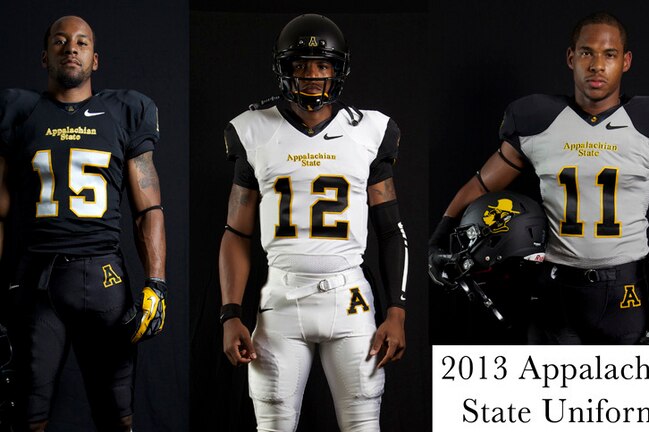
The skull n' crossbones is intriguing, but it could become really cartoony or hokey if the uniform is not done right. It could look decent if we went with a two-tone (white and black) jersey with either all black or all white pants. I could see something similar to App St's uniforms (substituting the yellow for scarlet).

Uniforms_crop_exact.jpeg


Last edited by a moderator:
Status
Not open for further replies.
Back
Top