You are using an out of date browser. It may not display this or other websites correctly.
You should upgrade or use an alternative browser.
You should upgrade or use an alternative browser.
2015 Alternate Unis?
- Thread starter Mierin
- Start date
- Status
- Not open for further replies.
Redux
Donor
Bugeater Throwback or dont bother! BUGEATER......POWER! BUGEATER......POWER!

zoogs
New member
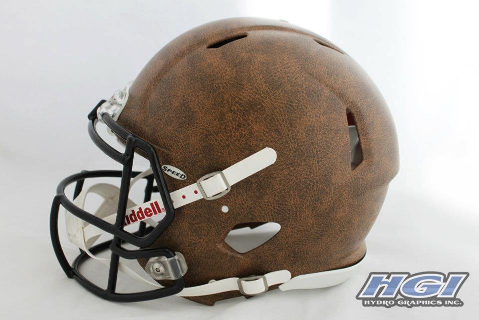
You know, that doesn't look bad. At all.Here's an extremely rough mock up of 1970 jerseys with matte white/chrome accent helmet. I suck at photoshop, but hopefully you get the idea. I think it could be sweet.

TITANIC VS LUSITANIA
New member
Is this year's uni going to look like those spring practice uniforms I'm guessing? Looks like they changed the stripes to go over the shoulder pad.
ZRod
Active member
Practice jerseys have been that way for a couple years. Wisconsin' s are the same as well.Is this year's uni going to look like those spring practice uniforms I'm guessing? Looks like they changed the stripes to go over the shoulder pad.
cornographic
Banned
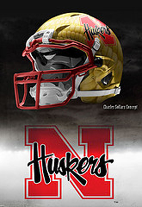
I like the corn helmet alot. Just use the traditional N instead.Could this finally be the year?
cornographic
Banned
Can't say as I love any of them, but they're ok. As to the 'Blackshirts' theme, wouldn't the skull and bones be better than just the word?


cornographic
Banned
I actually think that's killer!To see how ugly we can make this helmet design?
Can someone make this a white helmet with red outline?
Landlord
Banned
Can't say as I love any of them, but they're ok. As to the 'Blackshirts' theme, wouldn't the skull and bones be better than just the word?
The first alternate Blackshirts helmet has a skull and crossbones on it.
cornographic
Banned
Ooooohhhh, I did not notice that! Hmmm, I like that part of it alright, but the rest of the design is pretty bland.Can't say as I love any of them, but they're ok. As to the 'Blackshirts' theme, wouldn't the skull and bones be better than just the word?
The first alternate Blackshirts helmet has a skull and crossbones on it.
Last edited by a moderator:
icedavis
New member
I tweeted back and forth with Andrew Brandt about this specific reason. My argument was that the idea had a good foundation but the execution was not so good, specifically because the skull is mostly obscured and so someone viewing it the first time (especially a non-Husker fan) wouldn't notice or easily know that was supposed to be a skull and crossbones. To me, this is not as obvious as it should be considering it seems to be a primary design feature. I have run across a few husker fans that also didn't pick up on it right away. That's not to mention then, with the skull idea as is, that image would also imply the players either had a pair of bones in their mouths or as a "bone bow tie" which is out of place given my guess at intent. Bone bow tie though, now that i think about it....Ooooohhhh, I did not notice that!Can't say as I love any of them, but they're ok. As to the 'Blackshirts' theme, wouldn't the skull and bones be better than just the word?
The first alternate Blackshirts helmet has a skull and crossbones on it.
He said he was working to think the concept through more completely. So likely we will see an updated version from him.
Last edited by a moderator:
JTrain
New member
Basically Fraser Davidson's template was discovered by the general public in the last few months, resulting in thousands of really awful helmet concepts (usually presented in Bleacher-Report-circa 2010-style articles) by everyone with a copy of GIMP or PS and their brother. These things have become a big trend and even made it to sites like CBS Sports and NFL.com in service to tired web writers looking for off-season click bait.
Aside from the above concepts just being really ugly (having key elements run through the ear hole and under the face mask is just bad), the Photoshop work is very poor (as it almost always is with this trend). A football helmet is curved and any design element has to be adjusted to account for that (it's particularly noticeable in elements that nearly run the width of the graphic). Also, a helmet sitting on a flat surface like this one is actually angled backwards, as the helmet content is designed to look level when worn on a player, when the facemask naturally dips well below the back of the helmet:

When a helmet is on a flat surface, the design content will slant upwards, like this:

Davidson's template is incredible, and it's basically plug and play. But you have to use some basic graphic design tools and attention to detail to avoid travesties like those being posted left and right this off-season. Then, it's possible to get some beautiful stuff like this:
Source
Aside from the above concepts just being really ugly (having key elements run through the ear hole and under the face mask is just bad), the Photoshop work is very poor (as it almost always is with this trend). A football helmet is curved and any design element has to be adjusted to account for that (it's particularly noticeable in elements that nearly run the width of the graphic). Also, a helmet sitting on a flat surface like this one is actually angled backwards, as the helmet content is designed to look level when worn on a player, when the facemask naturally dips well below the back of the helmet:
When a helmet is on a flat surface, the design content will slant upwards, like this:
Davidson's template is incredible, and it's basically plug and play. But you have to use some basic graphic design tools and attention to detail to avoid travesties like those being posted left and right this off-season. Then, it's possible to get some beautiful stuff like this:
Source
Last edited by a moderator:
VA Husker2
New member
This again?
ENOUGH ALREADY
ENOUGH ALREADY
- Status
- Not open for further replies.