2015 Alternate Unis

Thanks for posting the third set.

The "36" helmet is the only one that mildly toots my horn, I don't really like the font of the number, it almost looks circusy. Still a mild tooting of my horn did indeed occur.

The rest are /meh or I just plain don't like at all.
I agree, I'd be okay with doing numbers on the helmet, but definitely not in that font. If we're going to go for a throwback look, I'd prefer it to not feel half-assed. That's also the reason why I'm not a fan of doing the NU on the sides unless it looks the same as the helmets from the '60s did.

 
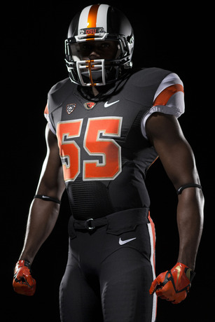
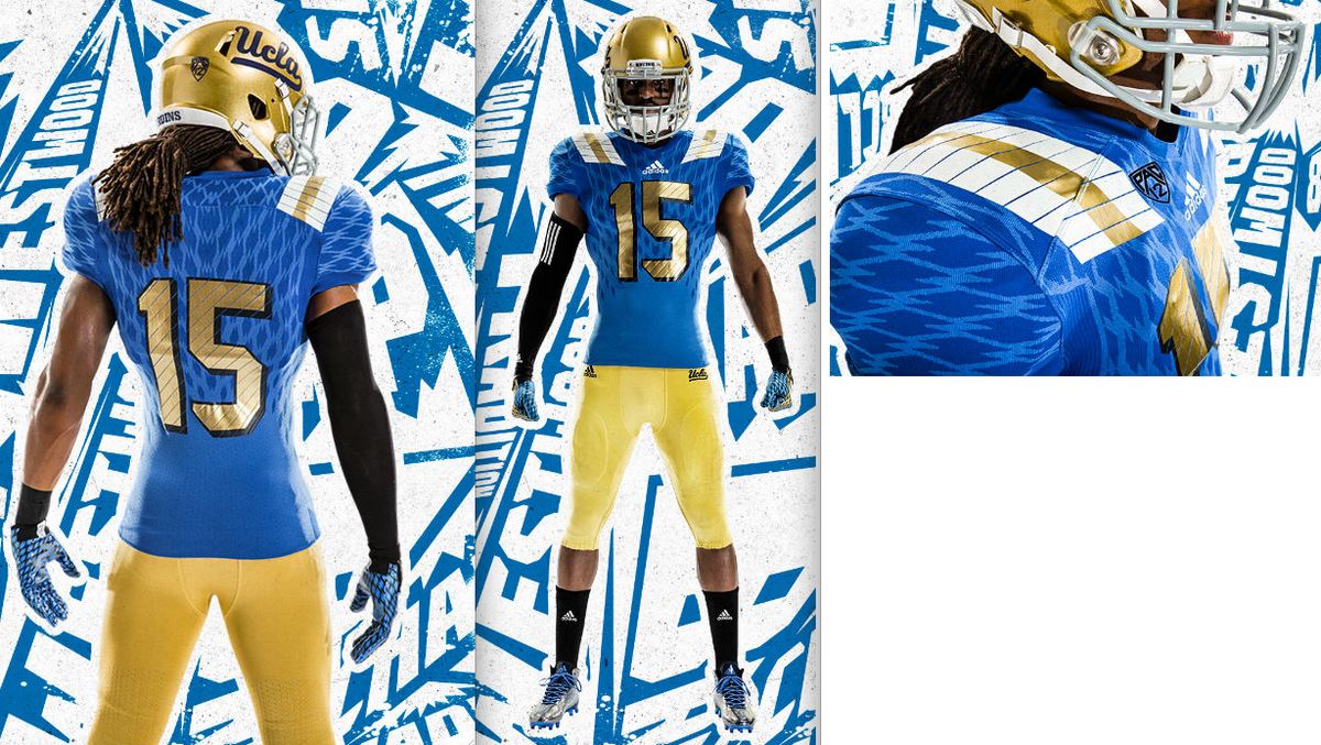
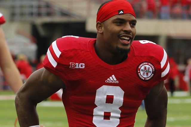
The problem I have with the alternates is 3 seasons ago they looked like jumpsuits or onesies. 2 seasons ago they looked like prison break unis. Last season the mocked up jersey Pelini threw on looked good enough, then game time comes around and you can't read the dang numbers (Made it hard to yell at the tv as to who messed up lolol). I get that recruits and players love em. I wouldn't be so against the idea if they came out with something that looks good, but they haven't which is why I become staunchier against them and would rather see a throwback to when tradition and smashing teams was more our MO instead of this gaudy-keeping-up-the-Ducks'-zero-title-winning-but-they-look-flashy-tradition. It's just not the Nebraska identity and I don't think it ever will be. just win baby, that'll cure this infectious idea of alternate unis to attract kids.

 
ejd8qr.jpg


Pearl/Matte Helmets - The White Version of the Vikings Helmets.
Chrome Red Accents - Could be a Thicker Stripe

Grey Facemasks - Maybe Dark Chrome

 
UCLA's 2015 home jersey was released this morning:

CJeowLoUsAAkGFi.png


If last year is any indication, our jerseys will feature even more of this chain link pattern.

ucla-bruins-new-football-uniforms-jerseys-2013.png


Ameer-Abdullah-Nebraska-2014.jpg


Back
Top