broganreynik
New member
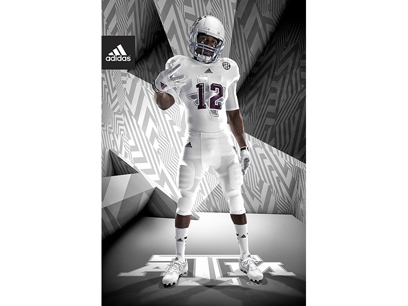
Uhh.. An actual new design? Kind of thought that was evident with my post...What else do you want?What a lazy design.
"Let's just do last years but with the colors switched up! Oh wait, let's add slashes to the numbers and pants and nobody will notice we forgot to design a new uniform!"
Either go all out or don't do it. This tepid slight change-up stuff is boring.
Thing is, in a vacuum, I'd like these (outside of the N on the pants). It's the fact that these aren't even a new design at all, just rehashed stuff from other unis.
Last edited by a moderator: