broganreynik
New member
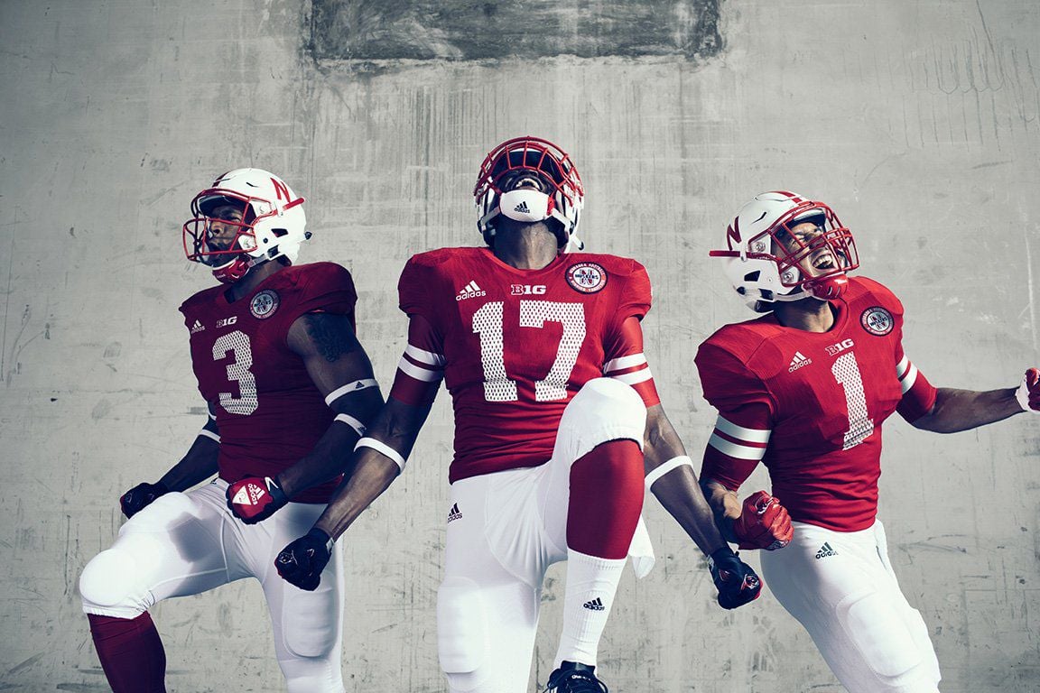
Same goes for the adidas logo on the pants; lose the stripes, switch to the left hip, and should be red instead of black.While I understand Adidas' decision to include the three stripes, I would have preferred they just had "adidas" on the shoulder. That would have helped the cluttered look immensely. The patch and TV numbers are off, but overall it's a cool look and I'm cool with it being my son's first "alternate" jersey.
It doesn't ruin it for me at all, just minor quibbles. It just seems odd that they'd leave out these details.