Does it tell us much to post electoral maps and maps shaded by income levels?
The maps have pretty colors.
Yes they do but hey they're just maps.
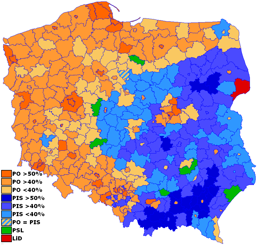
Here's a fun one. Poland most recent electoral map:
Civic Platform, PO, (orange) is the moderate to moderately conservative pro-EU party while Law & Justice, PiS, (blue) is the moderately-conservative to far-right-wing euro-sceptic party.
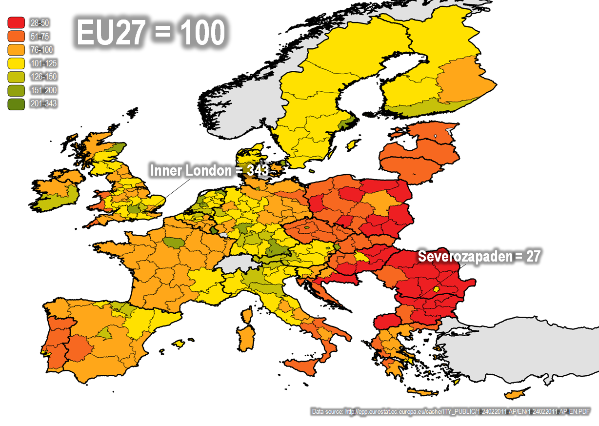
Best maps of Poland's income I could find:
As far as religious and ethnic considerations we can mostly rule those out as Poland is pretty homogeneously Polish and Catholic.
So from comparing those two maps it seems pretty obvious right? Eastern Poland, excluding Warsaw, is voting for PiS because they're poorer.
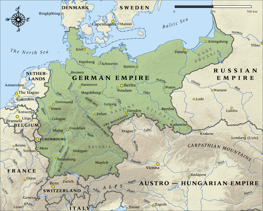
But wait. Everyone say hi to the Kaiser!
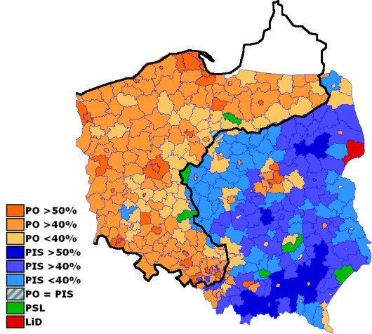
Maps. Combine!
So yea. Maps can be decieving and junk.